
HOME > Products : Uni-Type® : Uni-Type® Development(1) > Uni-Type® Development(2)
Uni-Type® Development(2)
(continued)Joint Research with Chiba University / Starting From Scratch
While our company performed digital processing operations, we asked Professor Miyazaki of Chiba University to help put together a design plan.
Professor Hibino of the graduate school at Chiba University evaluated the finished prototype through repeated experiments.
If the visibility of our prototype did not meet our quality standards, it was redesigned and tested once again.

 Each Japanese kana character has gone through this step-by-step process to produce the results below:
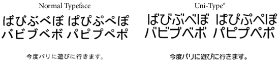 Voiced consonant marks can be added to the Japanese kana "ka, ki, ku, ke, ko", "sa, shi, su, se, so", "ta, ti, tsu, te, to", and "ha, hi, hu, he, ho."
Additionally, semi-voiced marks can modify "ha, hi, hu, he and ho."
Put together, these marks modify almost half of all kana characters.
This is why their design is such a significant part of Uni-Type®.
There had never before been a typeface that adequately addressed this issue.
Voiced consonant marks can be added to the Japanese kana "ka, ki, ku, ke, ko", "sa, shi, su, se, so", "ta, ti, tsu, te, to", and "ha, hi, hu, he, ho."
Additionally, semi-voiced marks can modify "ha, hi, hu, he and ho."
Put together, these marks modify almost half of all kana characters.
This is why their design is such a significant part of Uni-Type®.
There had never before been a typeface that adequately addressed this issue.
Now, there are several rules for designing voiced and semi-voiced sound marks, including:
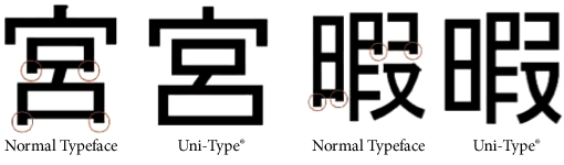
As detailed above, a lot of time and effort went into redesigning non-kanji Japanese kana. However, kanji, traditional Chinese characters used in Japanese, also received a makeover. When designing kanji, we broke down each character into parts and reconstructed them piece by piece.
Again, we focused on the fidelity of straight lines, especially horizontal lines. This is because characters that use gradients can break shape easily when the size is too small. The spacing between lines and characters was important to the design as well.
Superfluous lines, remnants of old analog designs, were also deleted to simplify the character design.
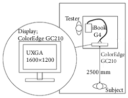
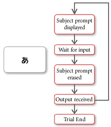
Lastly, we had subjects view sentences displayed using the typeface up to this point, and evaluated their response to the minimum readable size. This is how we confirmed that our designs let non-kanji characters look larger and clearer in small sizes.
While many subjects were in their teens or twenties, we also brought in subjects in their 50s and 60s to see how our fonts were received by seniors.
If a universal design is not recognized by society, it cannot truly be called "universal." In 2007, LIM was ranked 32nd out of companies in Japan working in universal design by NIKKEI DESIGN. The fact that our up-and-coming company was chosen to be a part of this top 100 list is quite a rare accomplishment, and it proves the universal value of Uni-Type® has been recognized by society.
Now, there are several rules for designing voiced and semi-voiced sound marks, including:
- On low resolution liquid crystal displays, avoid using gradients for straight lines
- Non-kanji (Japanese kana) characters should be drawn with large, clear lines, so that even small fonts are easy to see
As detailed above, a lot of time and effort went into redesigning non-kanji Japanese kana. However, kanji, traditional Chinese characters used in Japanese, also received a makeover. When designing kanji, we broke down each character into parts and reconstructed them piece by piece.
Again, we focused on the fidelity of straight lines, especially horizontal lines. This is because characters that use gradients can break shape easily when the size is too small. The spacing between lines and characters was important to the design as well.
Superfluous lines, remnants of old analog designs, were also deleted to simplify the character design.
Lastly, we had subjects view sentences displayed using the typeface up to this point, and evaluated their response to the minimum readable size. This is how we confirmed that our designs let non-kanji characters look larger and clearer in small sizes.
While many subjects were in their teens or twenties, we also brought in subjects in their 50s and 60s to see how our fonts were received by seniors.
If a universal design is not recognized by society, it cannot truly be called "universal." In 2007, LIM was ranked 32nd out of companies in Japan working in universal design by NIKKEI DESIGN. The fact that our up-and-coming company was chosen to be a part of this top 100 list is quite a rare accomplishment, and it proves the universal value of Uni-Type® has been recognized by society.