
HOME > Products : Uni-Type® : Uni-Type® Development
Uni-Type® Development
Introduction

Uni-Type® on a mobile phone
In 2005, a new generation of mobile phones was rapidly entering the market from a variety of companies, greatly increasing the amount of reading done on these LCD screens. As mobile communication through email became the norm, Japan's elderly population found it more and more difficult to participate.
Although younger users can handle the stress to their eyes, there is a tendency to fit smaller and smaller characters into a single screen. Even larger fonts are straining the vision of elderly users, and it seems like our society is being pushed to the limit. This issue has moved beyond email as more information, such as news, stocks, weather reports and SNS are moving to small screens. Recently, digital book services have also surfaced, where users can purchase and read entire books on mobile devices.
The need to display large amounts of information on a small screen will only increase, and we must maintain a comfortable reading experience. Our Universal Design Font, Uni-Type®, was created with this in mind.
There is a fundamental difference between typefaces for printing and those for display on a screen. On screens, improved visibility is more important than aesthetic design. Research has shown that 70% of characters used for email are not Chinese kanji characters, but Japanese hiragana and katakana. Thus, the design concept of Uni-Type® focuses on improving the visibility of hiragana and katakana.
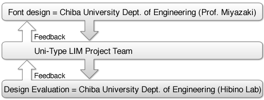
Joint Research with Chiba University / Starting From Scratch
Before going into the details of the font design process, we would like to explain our choice to collaborate with the education sector rather than simply develop in-house.
For us, the choice was clear: universal design cannot be limited by a single professional's subjective sense of what a font should be. First and foremost, a typeface designed to be "universal" needs to be evaluated by objective sources. Then we can move on to address the theme of legibility.
In terms of legibility, the small marks which differentiate the pronunciation of Japanese kana were very important. Since around 70% of electronic correspondence on liquid crystal displays involve these characters, it was essential that Uni-Type® show these marks clearly since a single mark can mean the difference between "Paris and Bali" or "path and bus." Through research, we devised a new way of thinking that improved the design of these voiced and semi-voiced consonant markers that put emphasis on functionality and clarity.