HOME > Products : Uni-Type® : Developer's Concept(1) > Developer's Concept(2)
Developer's Concept(2)
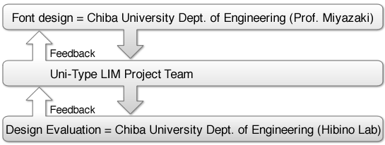
3. Meeting the Demands of Society

Michio Miyazaki
Chiba University Engineering Dept. Grand Fellow
(retired 2006)
LIM Technical Advisor
In our information-based society, we also increasingly rely on clearly displayed numbers to convey anything from transactions to meeting a friend at an appointed time. So, we have both words and numbers that demand an extra level of clarity.
In the first case, with dakuten, large face fonts made it quite difficult to discern the small dots. We overcame this via Uni-Type by mimicking traditional Japanese calligraphy. In calligraphy, dakuten are more stylized and elongated, making them more distinct and easily visible. This development succeeded in making this key element of Japanese writing clear and legible, even with large face fonts.
As for numbers, there was some initial difficulty in distinguishing between 3, 8, 5 and 9. LIM was again able to clear up this confusion by making a clear distinction between straight lines and curved lines. Through the interplay of straight and curved, we can increase the beauty and clarity of our characters.
LIM Uni-Type has always received high praise, but it is still necessary to tackle the new demands of a changing society. Uni-Type seeks to renew the concept of universal design for Japanese kana and over 7,000 Chinese characters.
4. Universal For All
To make a font easier to read, one must consider
Furthermore, there are many devices, such as mobile phones and PCs, that allow the user to freely set font size, line spacing and background color.
With such font design software and hardware, there is an environment that supports the individual demands of users. As a result, we can now offer fonts that are easy to read for everyone. This should be the ultimate goal of universal design: clear, legible fonts for all.
For more details, please feel free to email us.
- character design
- how the characters look together
- the background
- the display medium (LCD, paper, etc.)
Furthermore, there are many devices, such as mobile phones and PCs, that allow the user to freely set font size, line spacing and background color.
With such font design software and hardware, there is an environment that supports the individual demands of users. As a result, we can now offer fonts that are easy to read for everyone. This should be the ultimate goal of universal design: clear, legible fonts for all.
|